
Case Study, Ayliza
Ayliza
1 The Problem
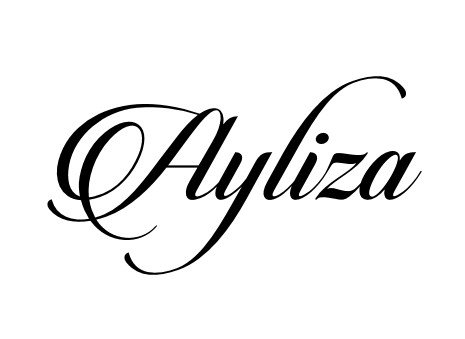
A name like Ayliza is the logo: the identity had to be found inside the letterforms themselves, feminine and memorable without a symbol to hide behind.
2 Our Approach
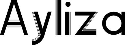
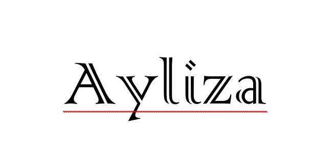
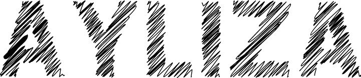
We developed the Ayliza wordmark through a family of directions, the flowing calligraphic script, an art-deco cut, a classical serif and a hand-sketched study, each drawn from the same name.
Shown: the Ayliza script wordmark and three of the developed directions. Created for a client on Fiverr (@thedesignpk).
Related Work
More Logo Design projects
Other projects from the same service, drag or scroll sideways.


Want results like these?
Tell us what you want to achieve, we’ll reply within one business day.
Start Your Project →